Part of Phase III of the Propensity to Cycle Tool project, awarded to the team by the Department for Transport to add new features, was to ensure the routing data remained up-to-date. In March we launched the School Travel layer, which provides insight into routes with the most cycling potential to inform investment and policies to reduce air pollution and increase activity levels among children nationwide (Goodman et al. 2019). This post describes the launch of another new dataset, more subtle but perhaps equally important as the School Travel layer: updated route data for the commuting layer in the PCT.
Why update the routes?
The quickest way to get from A to B would remain largely static if the network didn’t change. However, the cycle network in many cities is evolving. This is generally a good thing: new cycle infrastructure can reduce journey distances and the PCT should be based on the latest data. A new bridge, for example, could lead part of a network to shift such that investment in ‘feeder routes’ is necessary to create a cohesive cycle network. (Less positively, severance could reduce cycling potential, for instance if a cut-through for cycling is blocked).
A good example of the importance of updating the routes to reflect new infrastructure can be illustrated with reference to Sunderland. The Figures below show a ‘before and after’ image of the LSOA route network at this location: in the top image there are only 2 crossings along ~3km of the River Wear shown in the maps. In the bottom figure there are 3 crossings, showing a substantial increase in cycling potential along the south bank of the river around European Way (see the area in Google Maps and on http://www.pct.bike/m/?r=north-east).
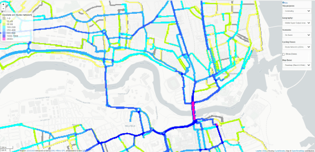
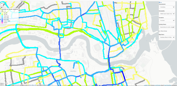
The new routes over the river to the West of the bottom map was made possible thanks to the Northern Spire Bridge, opened in August 2017, after the old route data was generated. This shows that OSM is evolving, thanks to thousands of contributors across the world, and is more than 80% complete according to a recent paper (Barrington-Leigh and Millard-Ball 2017). The OpenStreetMap data underlying the routes generated by CycleStreets.net, who provide routing services for the PCT, is constantly evolving. New contributors add to and improve the data all the time, making the routes generated more realistic over time.
The ‘before and after’ screenshots also illustrate another improvement: the new route network layer (LSOA, image) does not ‘double count’ cyclists where 2 roads meet or run parallel to each other. Therefore, while the bridge to the East in the top image shows a Go Dutch potential of 2000+ cyclists, the bottom image shows 1,000-2,000.
For these reasons over the last few months we’ve been preparing an update to the commute layer. The results may be slightly different in some places, for example, if the fast route along a particular desire line becomes shorter, the estimated levels of cycling uptake will increase slightly, reflecting the fact that people are more likely to cycle short distances (assuming there is good infrastructure).
Updated route network data
Initially, the PCT was based exclusively on data at MSOA level, each inhabited by around 7000 people (Lovelace et al. 2017). The ‘vector route network’ layer is based on this input data and was initially the only route network layer available. In early 2017, however, we expanded the PCT data to include data representing trips between LSOAs, each of which homes around 2000 people, as outlined in the blog article Lower Level Super Output Area route network now up!.
Due to computational constraints, we only provided the route network representation of these new ‘LSOA routes’ as a raster image. The clickable vector layer was still that based on the MSOA route data. Thanks to developments in the R package stplanr (Lovelace and Ellison, 208), the computational constraints preventing us from building route networks on the larger LSOA routes no longer apply.1 We have therefore decided to replace the MSOA route network layer with an LSOA route network layer generated. The results show the benefits: the figure below, for example, shows the before and after route networks in Hereford and Worcester.

An updated near market scenario
In terms of the user interface, the PCT remains unchanged, with one major exception. We have added a new national scenario called Near Market (equality), which you will notice on the dropdown menus. This will be described in detail in a subsequent post. For now, the main message is that up-to-date route data, and associated route networks, have been added to the PCT, making the data even more useful for transport planning in an ever-evolving transport network. As before, you can download the data, as described in the final section of this blog post.
Data downloads
Making the code underlying the PCT, hosted at github.com/npct, open and transparent was always an important component of the project. Making the data open access ensures that local authorities and others can make the best use of the work. We have made all the new route data available in the web application from the Region data and National data tabs, as illustrated in the screenshot for the West Yorkshire region below (see this hosted at http://www.pct.bike/m/?r=west-yorkshire ).

The new data, and associated uptake values, replace the old data for all geographic levels: zones, desire lines, routes and route networks. The MSOA route network data is no longer available as it has be superseded by the LSOA vector route network data. The new data are available as .Rds files which can be read into industry standard open source data analysis software such as R or or QGIS.
References
- This is thanks to the new function
overline2(), which is 2 orders of magnitude (100+ fold) faster than its predecessoroverline()

This is great. What I would also like is the ability to draw the map with routes coloured by the ratio so that it is possible to see at a glance where the greatest increases would come if there was an improved route there.
The other and rather harder thing I would like is the ability to go ‘What if we built a new route here?’ and hence compare options for new off-road routes.
LikeLike
Glad you like it 🙂 In terms of (1), I suggest you use the data downloads available from pct.bike and then use a package like QGIS to symbolise and visualise the ratios as you want – it’s a good idea, but there’s a limit to what we can show on the tool itself. (You might want some threshold in terms of absolute numbers, e.g. an increase from 1 to 10 cyclists would be tenfold but not in practice very exciting!)
For (2), indeed that would be harder! (assuming you mean, for instance, a completely new greenway route). The tool only routes people on the existing legally cycleable network. So considering options for a new Greenway route would imply doing a bespoke analysis project, because you would want to go back to the cycling potential calculations and calculate what additional potential would be enabled by the new route (which you could do in R for instance, or in a GIS package, drawing on the new route and then plotting the new routes using the OD data to see how it affects people’s routes). Not impossible but not something we could incorporate in a national tool!
LikeLike
Thank you. For (1) I could use QGIS but as someone who has never successfully used a GIS program (my research has not yet had geographical aspects) I would spend much more time learning how to do it than actually doing it so it is unlikely to ever get sufficiently far up my TODO list to get done. A low barrier to entry is important to getting high levels of usage from your tool.
2) Yes this is a lot harder. However, I am thinking of my mum trying to get greenway routes built in Scotland (admittedly you don’t have data for Scotland ATM). She last wrote some BASIC programs in the 80s so wouldn’t be able to do this. There also isn’t really support available from officers/consultants who could do this. Is it possible to build a tool which makes this really easy?
I am also thinking of the totally inadequate models built by consultants for the University of Cambridge to assist with its planning applications. Something where you could say “If we upgrade these bits of route to Dutch quality where will the cycle traffic go” would be really useful (particularly if we could calibrate it with some surveys of current usage).
In general what you have is great but how can you make it more directly actionable?
LikeLike
Hi Daniel – if there’s space you’d be welcome on one of my free training courses where I teach people how to use QGIS for PCT bespoke visualisations/analysis in an afternoon. Trying to lower entry barriers 🙂 For (ii), I think one might be better off trying to modify existing traffic models, or using some local expertise (advocacy campaigns often have people with tech knowledge) to do something bespoke. I doubt anyone is going to be able to create a national tool to easily do what you want (but it would be lovely if they could!)
LikeLike